A Responsive Redesign:
Comax Agricultural Technology


"That beautiful feeling of enrichment that comes from new discoveries, new ways of doing the same thing better than before." - Massimo Vignelli
A well-designed website brings its users joy, and designing a website that achieves this brings me joy! Beautiful design doesn't only hinge on aesthetics, however — a user's experience is defined by usability and accessibility as well.
Comax is a livestock technology firm specializing in the R&D, design, and construction of livestock farms and equipment. This project is an overhaul of Comax's website with a focus on usability and accessibility improvements.
Type
HTML/CSS, Figma
Date
October 2020
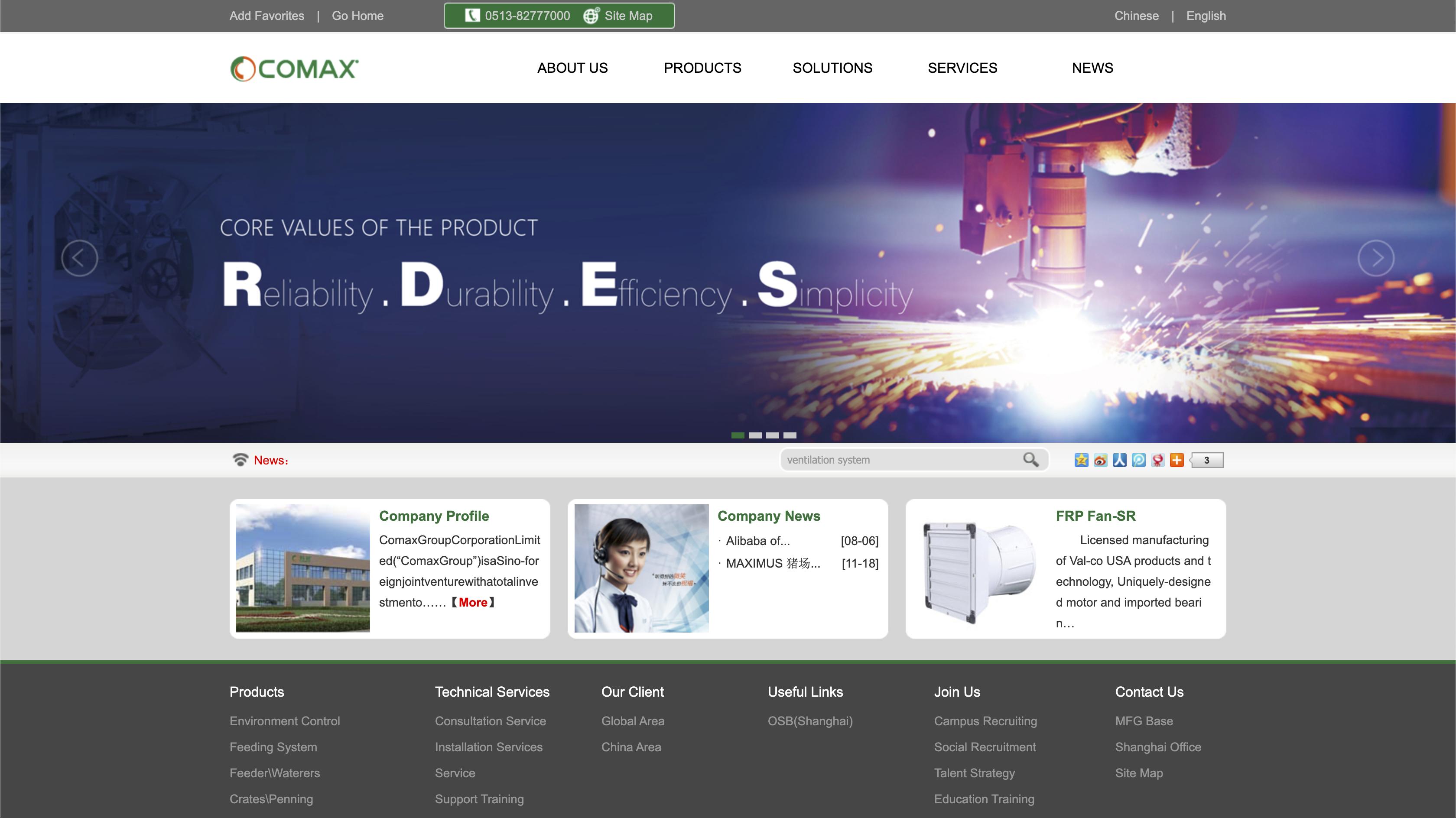 Comax's old homepage
There are several features of the current homepage that lead to usability and accessibility issues.
Usability has 3 sub-categories — learnability, memorability, and efficiency.
Are users of different abilities able to interact effectively? This was tested using WebAIM WAVE.
I began by using Balsamiq to create low-fidelity wireframes of the redesigned website on 3 devices: a desktop, a tablet, and a phone.
I then used Figma to build more realistic, high-fidelity prototypes for each of the 3 device types.
High-fidelity style guide, and desktop, tablet, mobile prototypesThe first frame in the above Figma embed is a style guide, highlighting the uniformity of static elements (color, typography, and icons) as well as the behavior of the interactive elements (navigation links and buttons).
Several screens also illustrate how the interface behaves responsively.
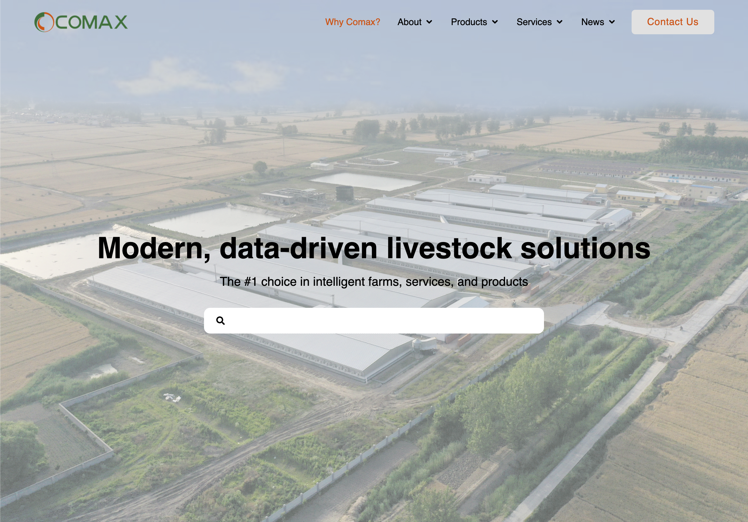
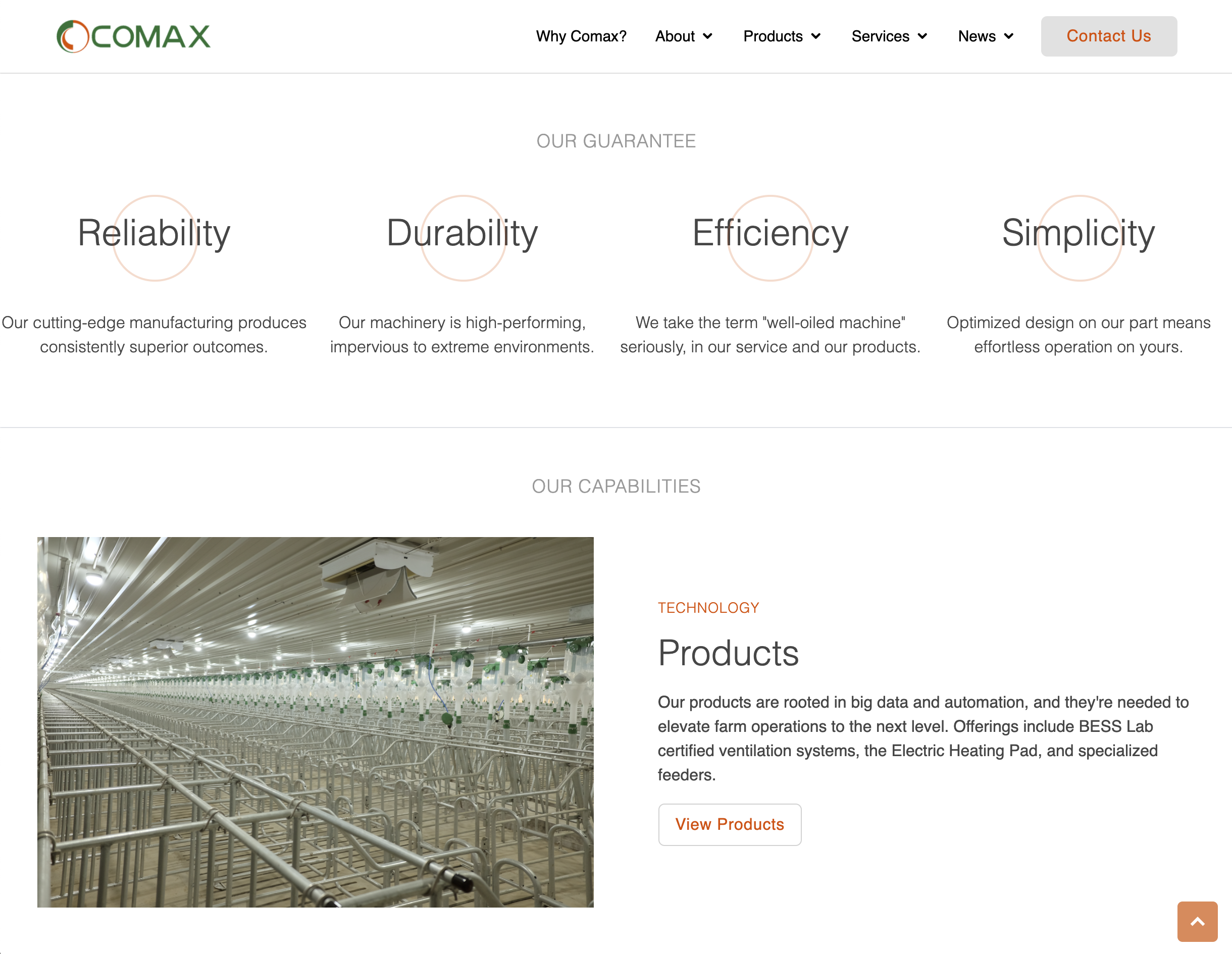
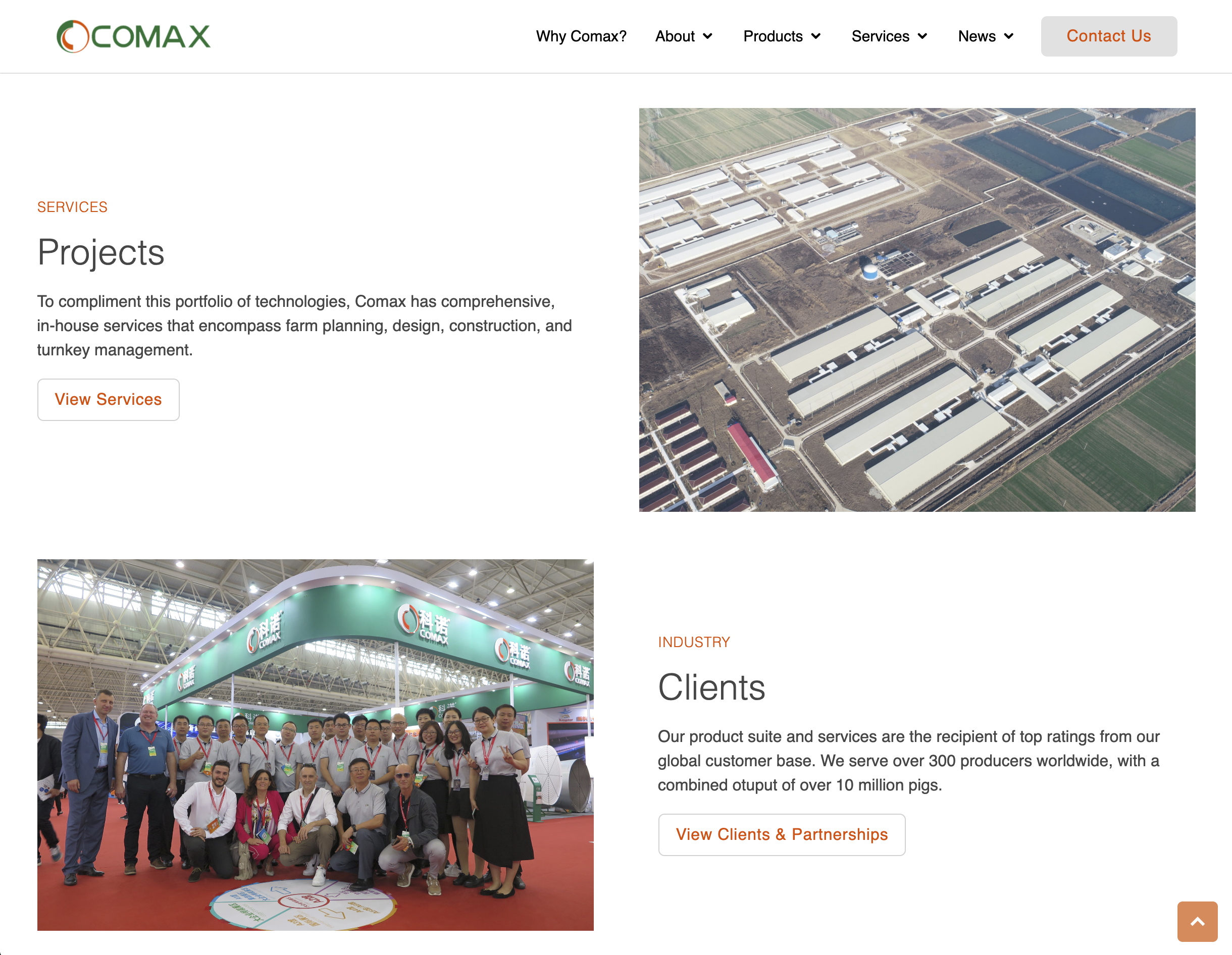
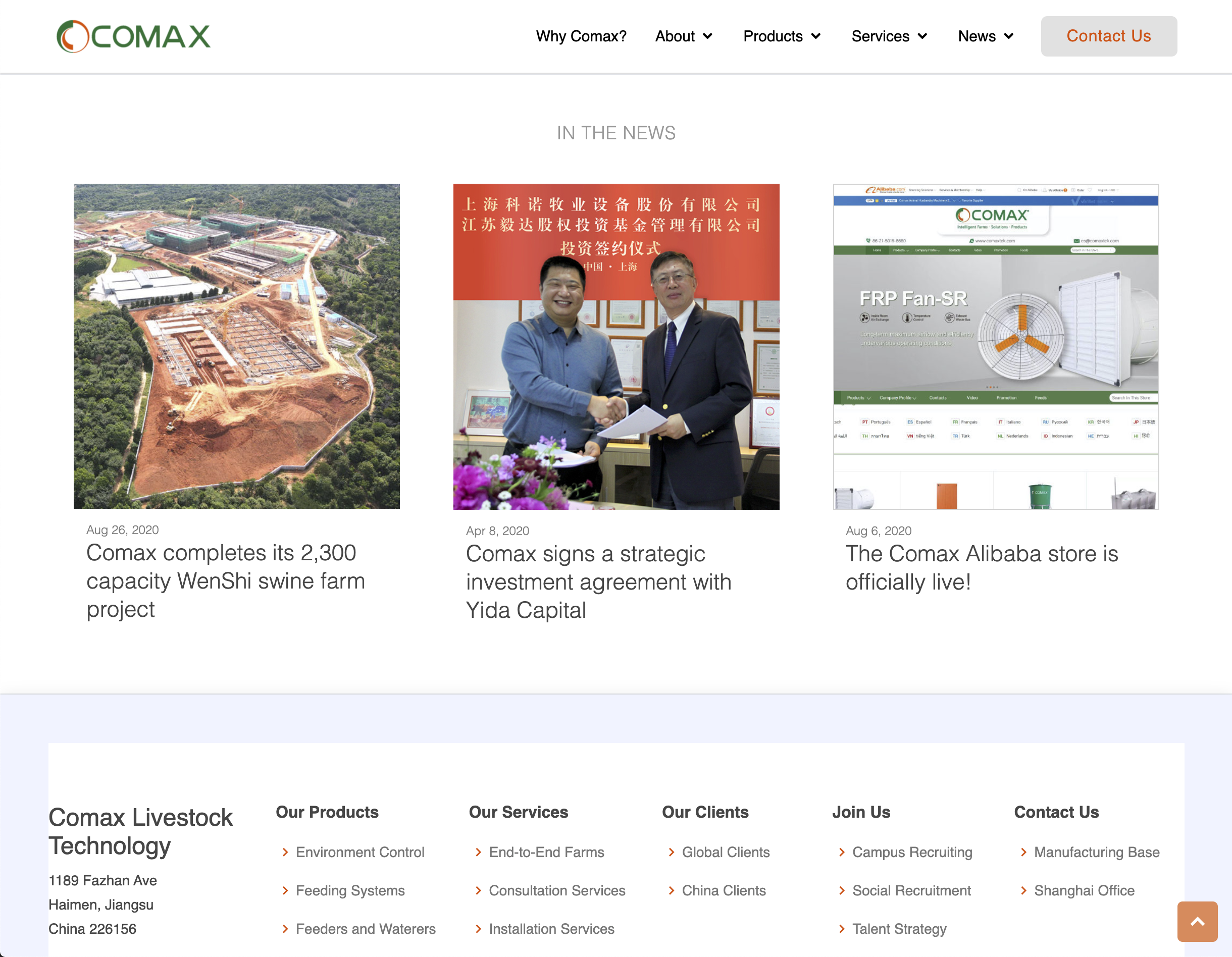
Finally, the end product: check out the responsive redesign of Comax's website here!
Feel free to experiment with the screen size or simulate the interface on different devices using Chrome Inspector.
Excepting the navigation bar, the page was built entirely from scratch.
Here's a preview of the interface's desktop view (spoiler: it looks almost identical to the hi-fi mockups!):
