Iterative Design
of Electry (a YC '20 startup)
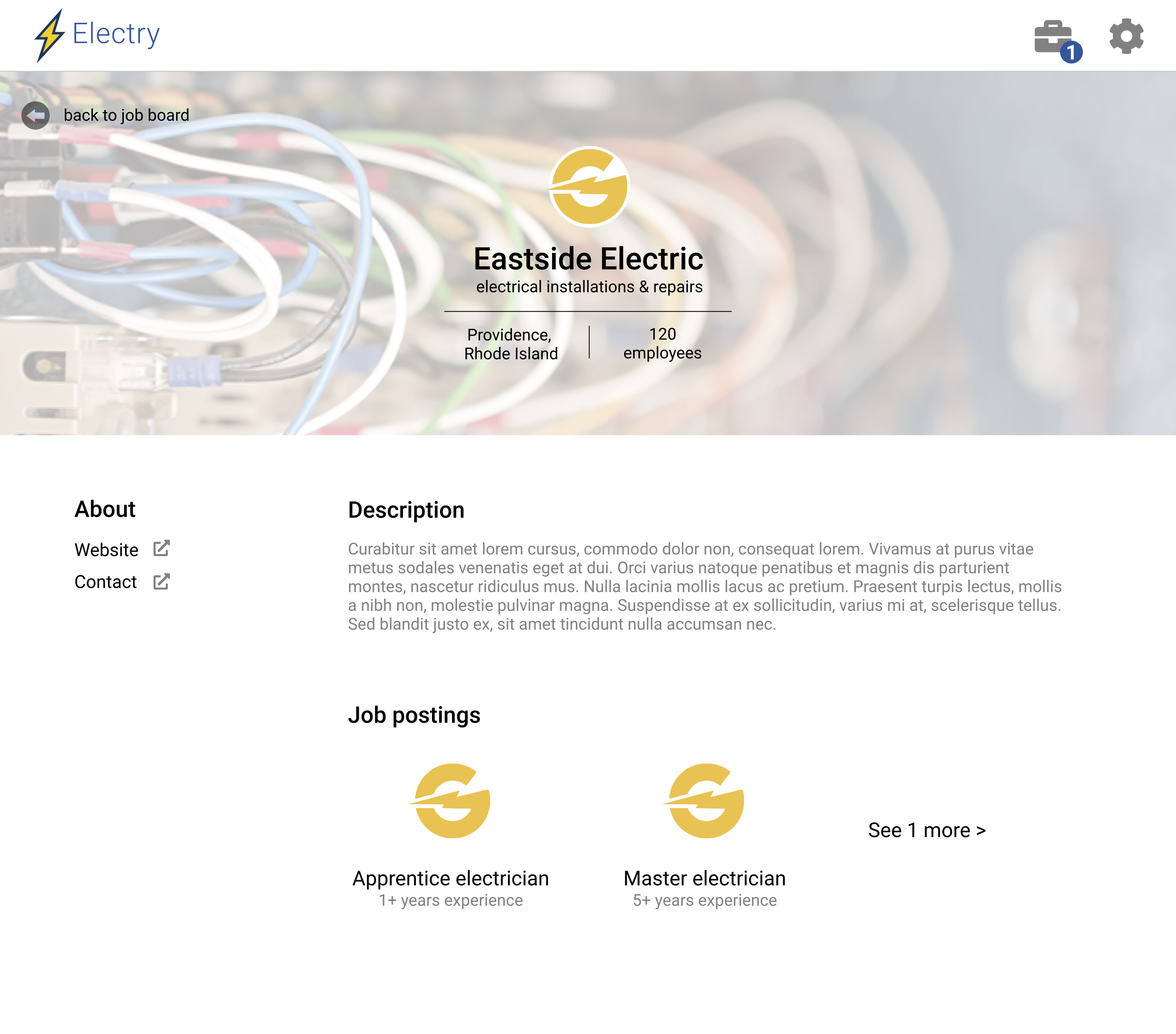

Electry is pitched as “LinkedIn for skilled blue-collar workers.”
With a team of 3 others, I iteratively designed Electry's web interface, beginning with low-fidelity designs and culminating in user testing.
I chose Electry, because I wanted to explore a familiar problem to students — finding employment — in a different industry — blue-collar work.
Type
Design: Balsamiq, Figma, UserTesting.com
Date
November 2020
Essentially, Electry is a job board to connect blue-collar workers with companies looking to hire them. Companies publish job openings on the platform, workers to find opportunities that match their qualifications and preferences, then the companies can follow-up with applicants off-platform.
We began by independently creating rough sketches to brainstorm without the bias of other people's ideas.
Some drew interfaces heavily inspired by LinkedIn, others focused more on the job-seeker onboarding flow, still others designed from the company's POV.
My rough sketches:
We then came together to decide on 1 cohesive concept and manifested it in several wireframes.
Some examples:
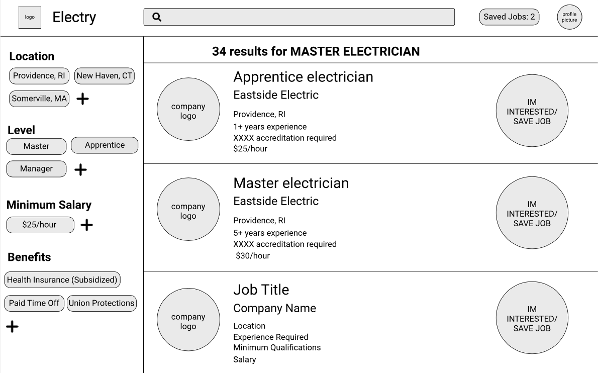 Employee POV search results: people/companies, connect/follow
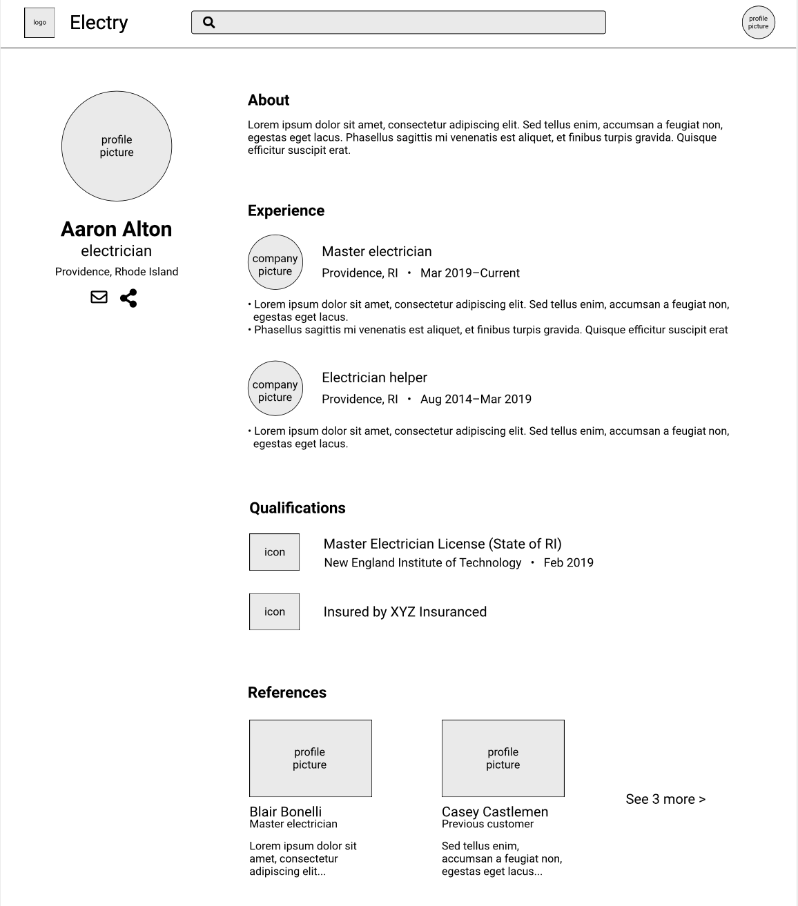 User Profile: about, experience, skils, stats
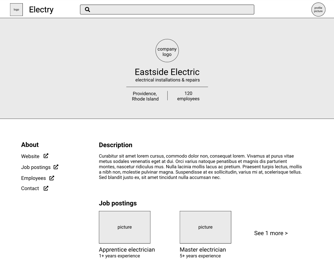 Company Profile: description, jobs, links
Based on those wireframes, we created high-fidelity prototypes with Figma. During our prototyping process, we received feedback from an industry UIUX expert. From this feedback, our most notable changes were to 1. "gamify" the onboarding process to be a flow — and 2. narrow our focus to only job-seekers.
Notable concepts:
We conducted our own usability test through a remote user testing service (UserTesting.com), using our interative Figma prototype.
Their scenario: You are a trained blue-collar worker looking for a job.
The UserTesting results were very positive! They showed that users were generally able to complete the tasks without any issues. Users enjoyed the interface's "simplicity and visual cues".
Some users had trouble navigating away from “My Jobs”. Because of this, we should add a "Go back" button to the page to assist in navigation.
This is one of few projects during which I interacted firsthand with users of my product. Feedback from the industry expert and regular users was immensely rewarding, and expedited the iteration process. It illustrated how we often subconsciously design according to our own biases and the importance of a diverse team.